Case study
HIKI
What does a sweat brand look like when it’s built for real people and real needs?
The problem
Sweat care was designed around the brand, not the body. Products promised to hide sweat rather than meet the real, everyday needs of the people living with it.
The insight
The people who sweat know best. arfa built its range with its community, so the brand had to feel like it came from them: honest, unfiltered and for everyone.
The idea
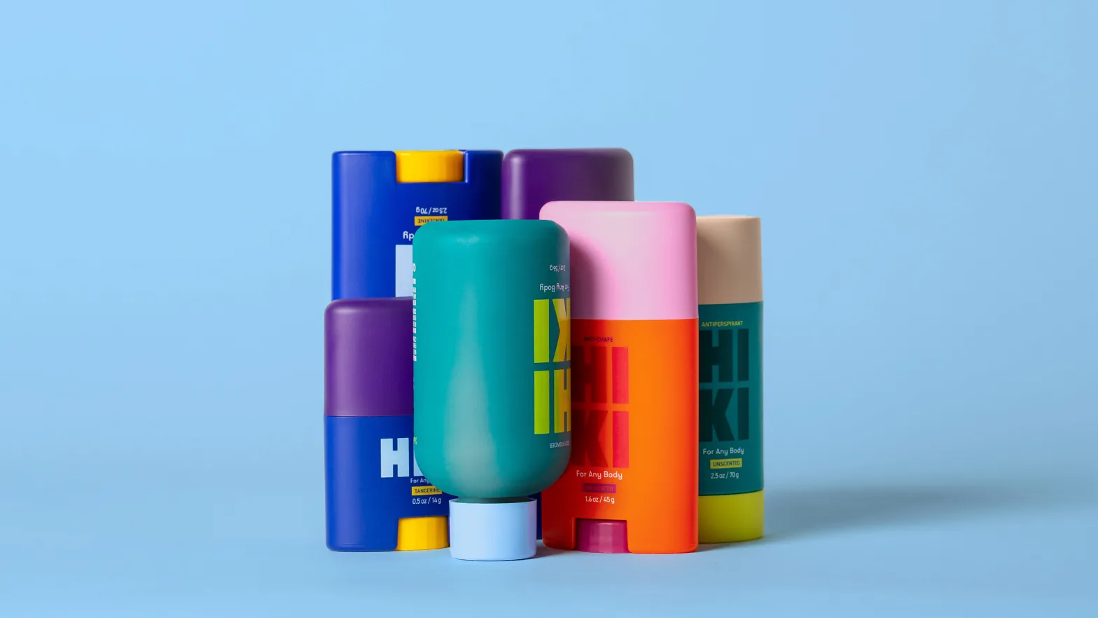
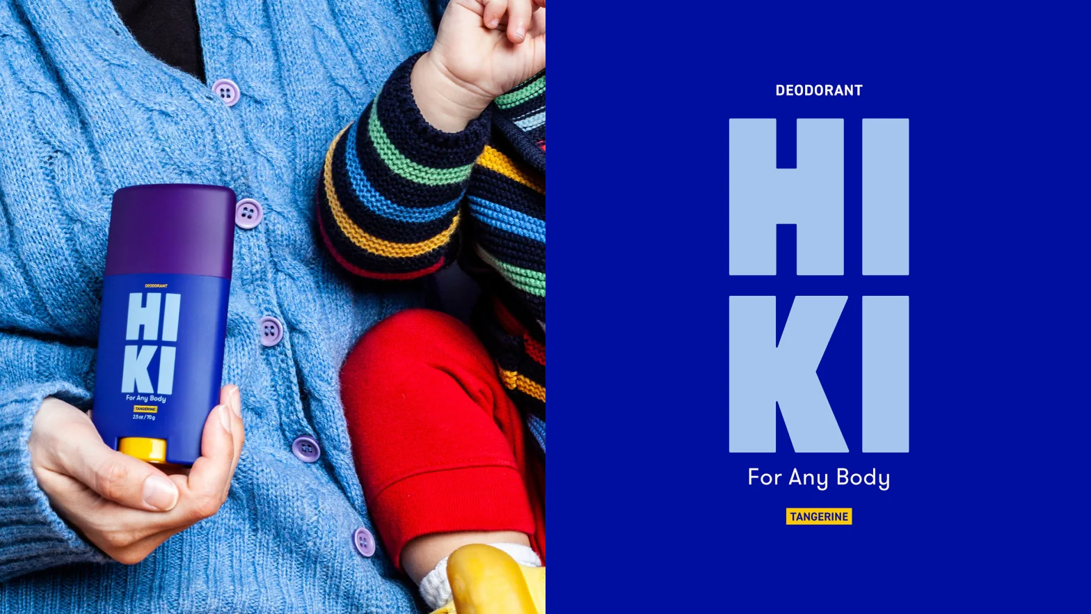
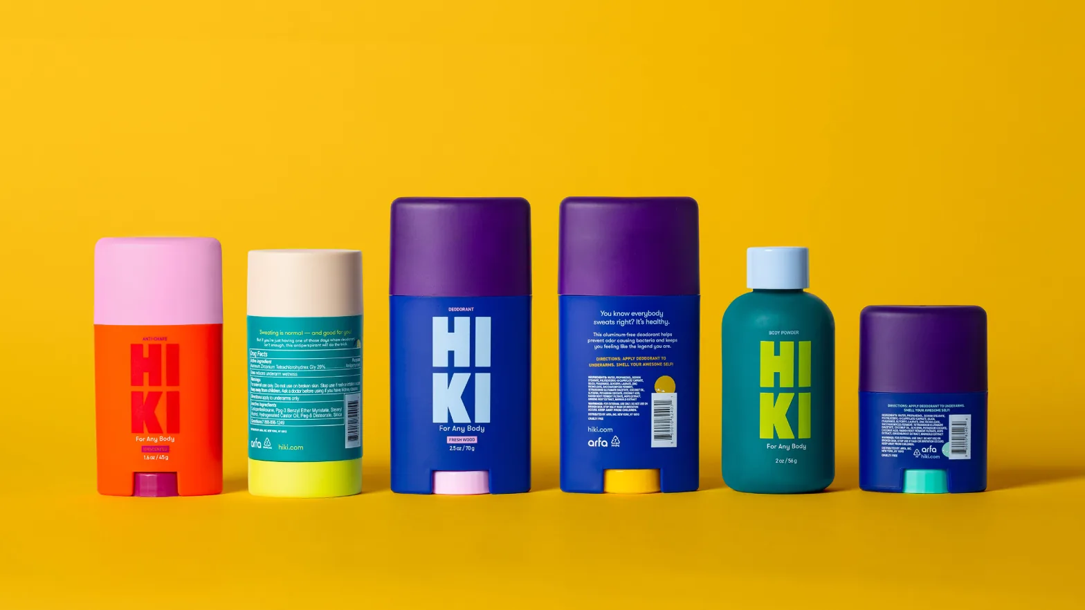
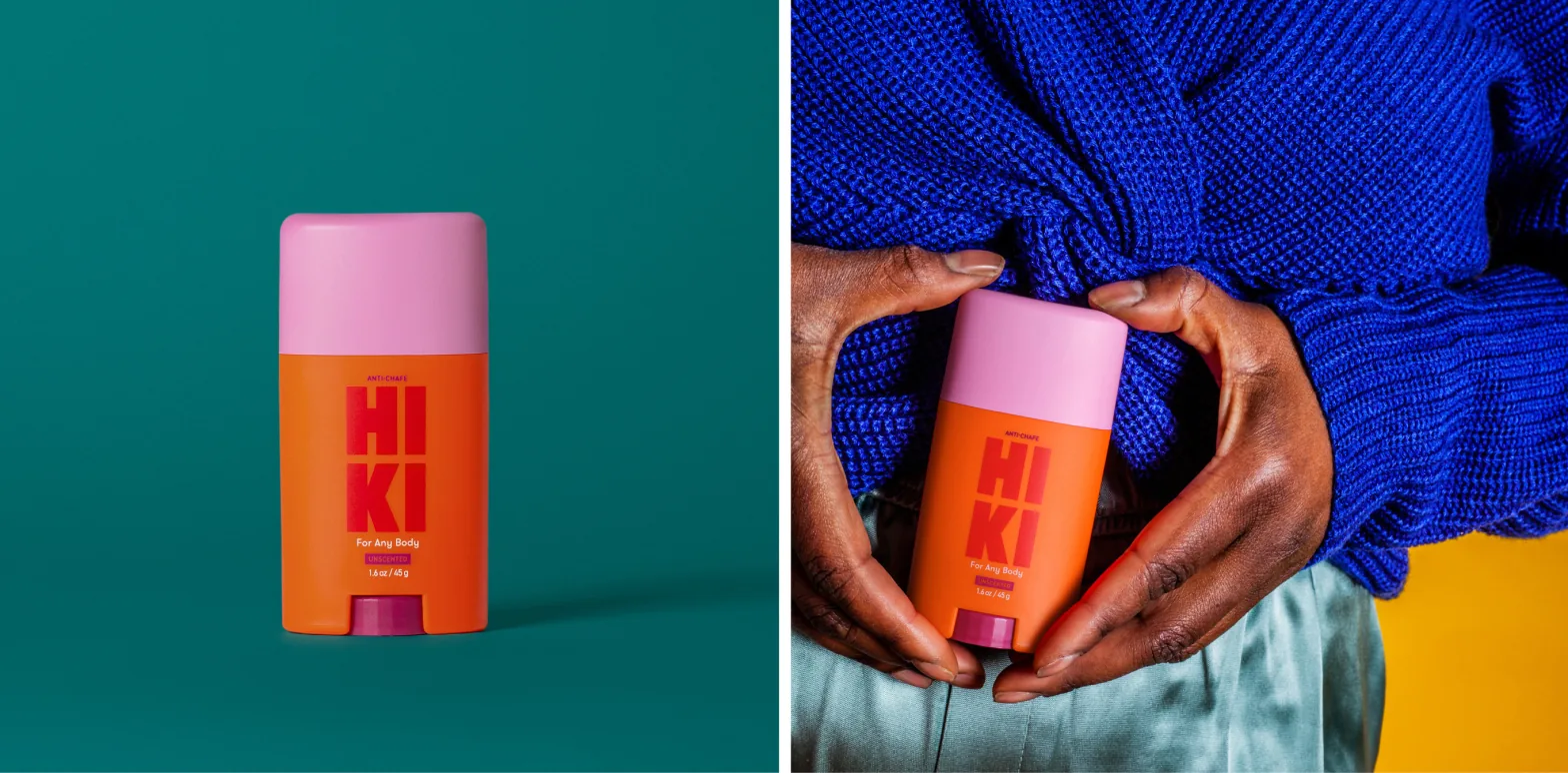
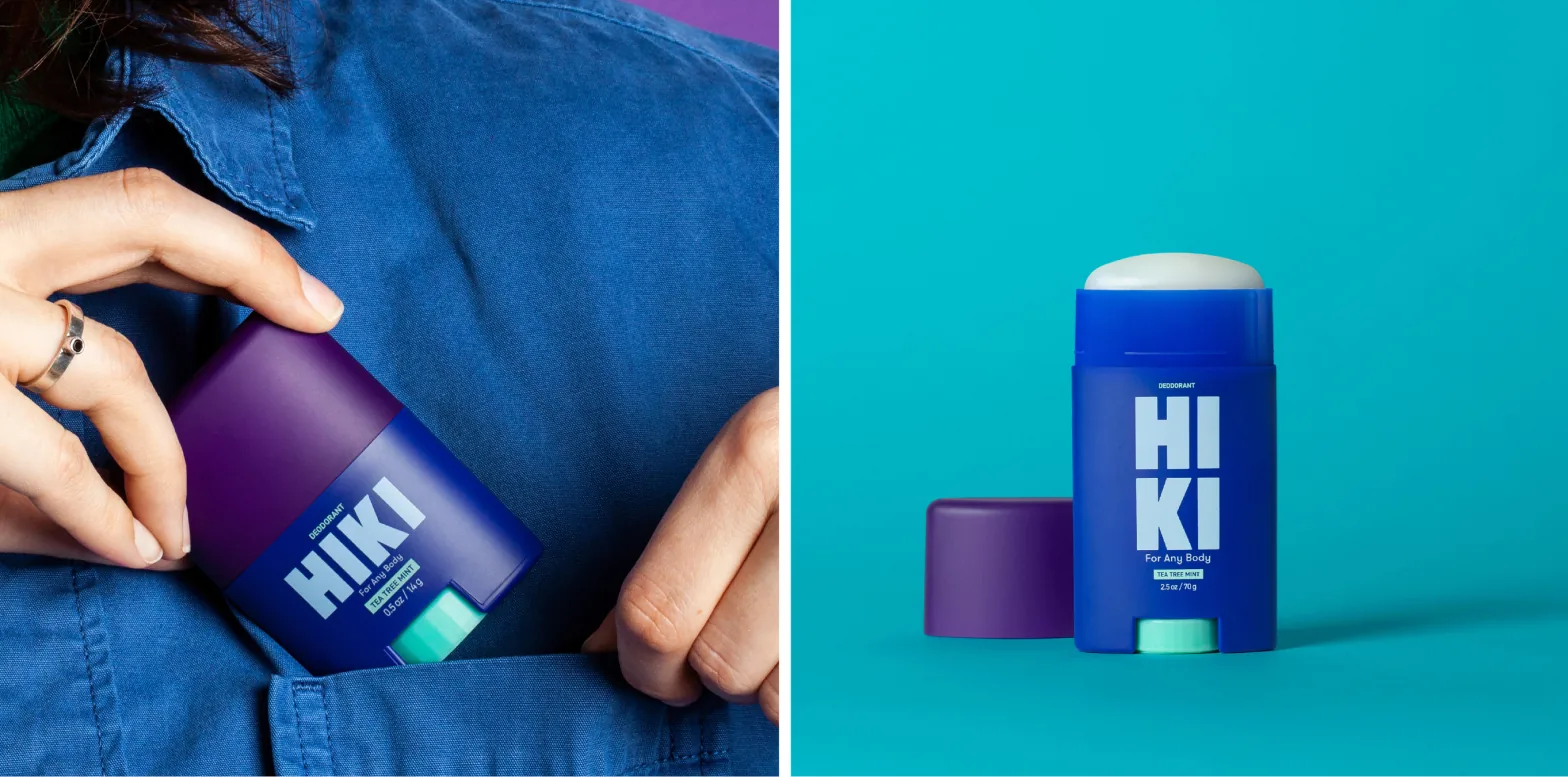
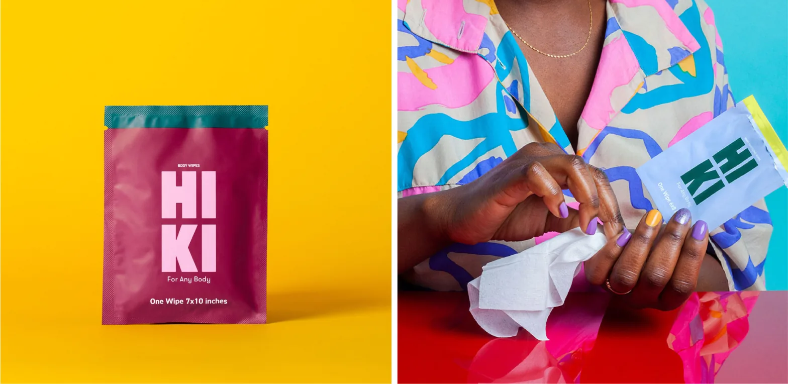
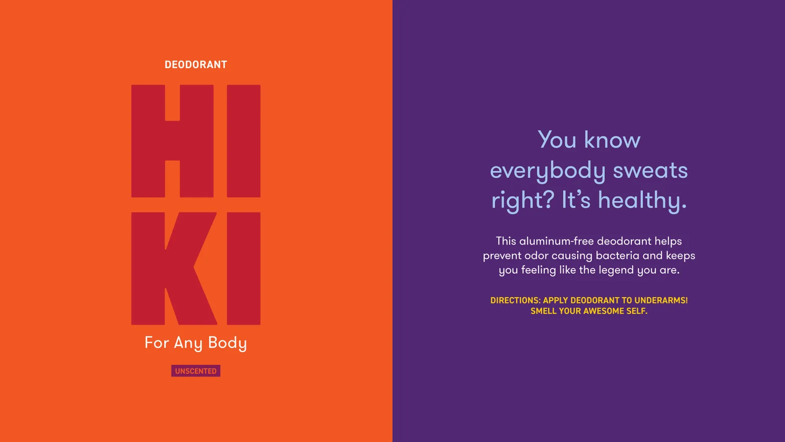
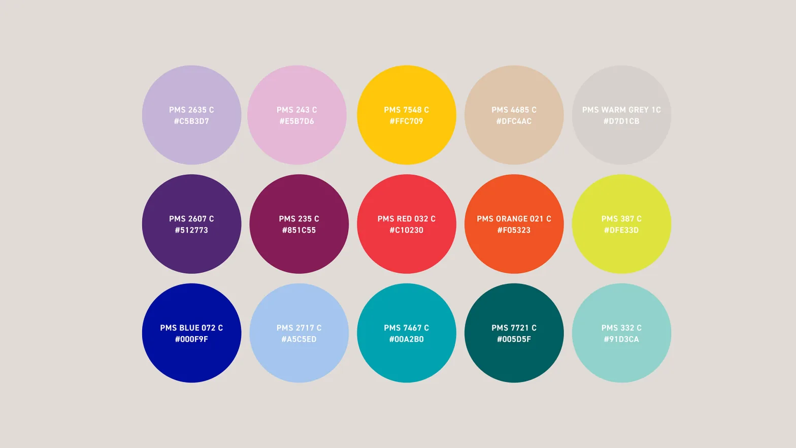
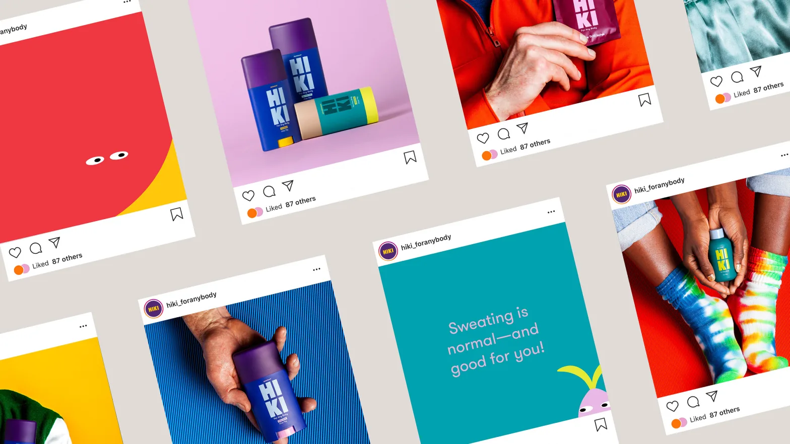
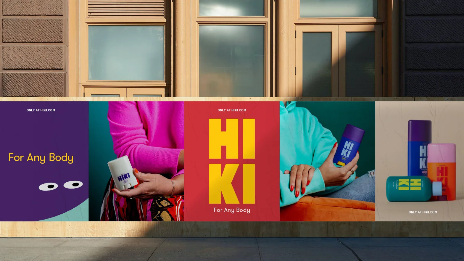
For Any Body. Named HIKI, Finnish for “sweat”, and stacked playfully into a bold mark. Unisex colour and close-up imagery made sweat something to talk about, not hide.
Impact
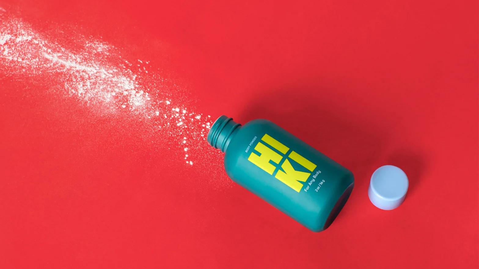
Launched in the US as arfa’s community-built sweat range, from deodorant and anti-chafe sticks to body powder and wipes. One identity across packaging, e-commerce and social.
My role
Senior Brand Designer, Aruliden. Presented creative to the arfa team and collaborated closely with brand and industrial designers across CMF development, identity rollout and website design.